WORK
MEIJER
C-STOP
SCOPE: strategy + design
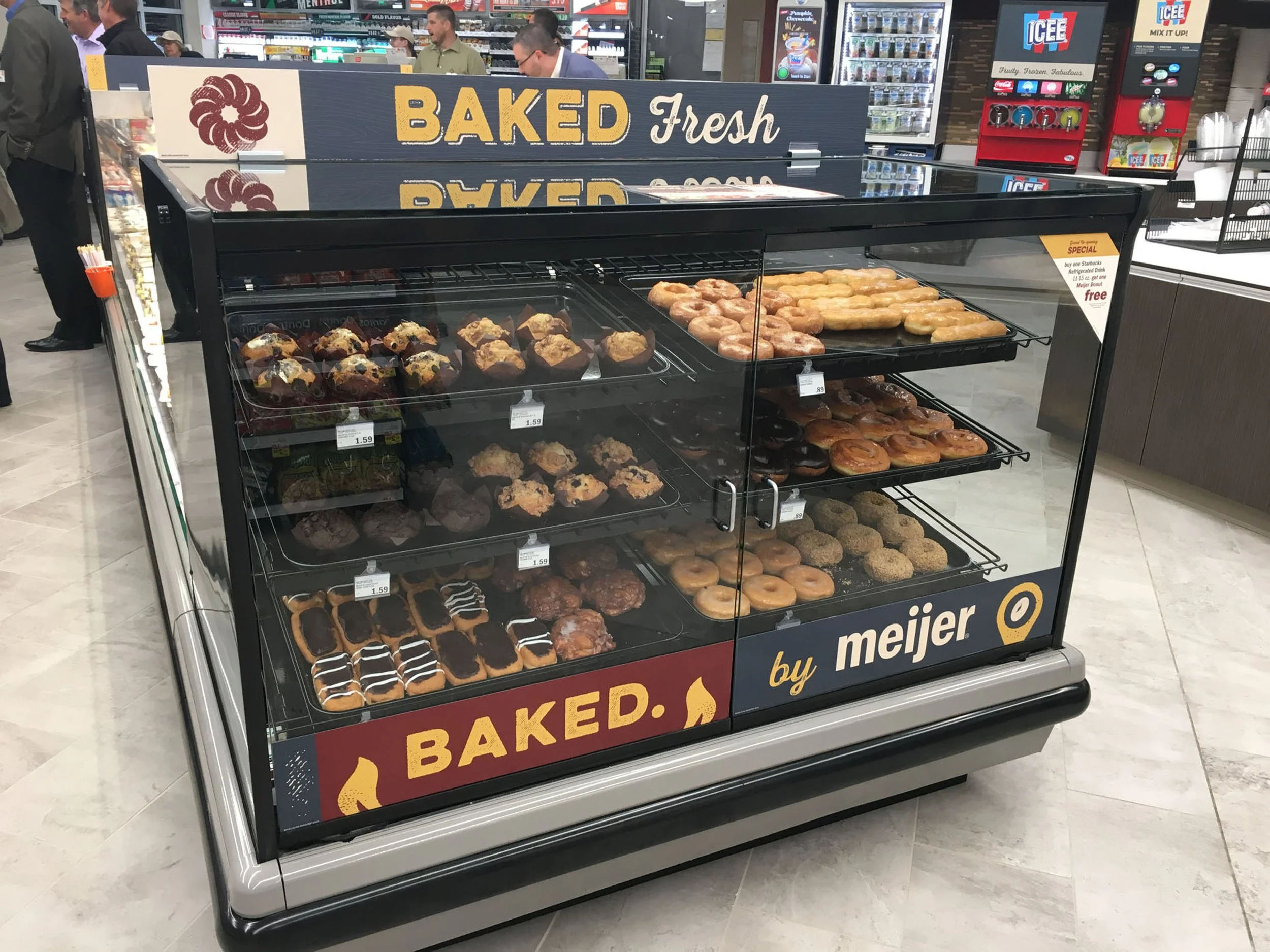
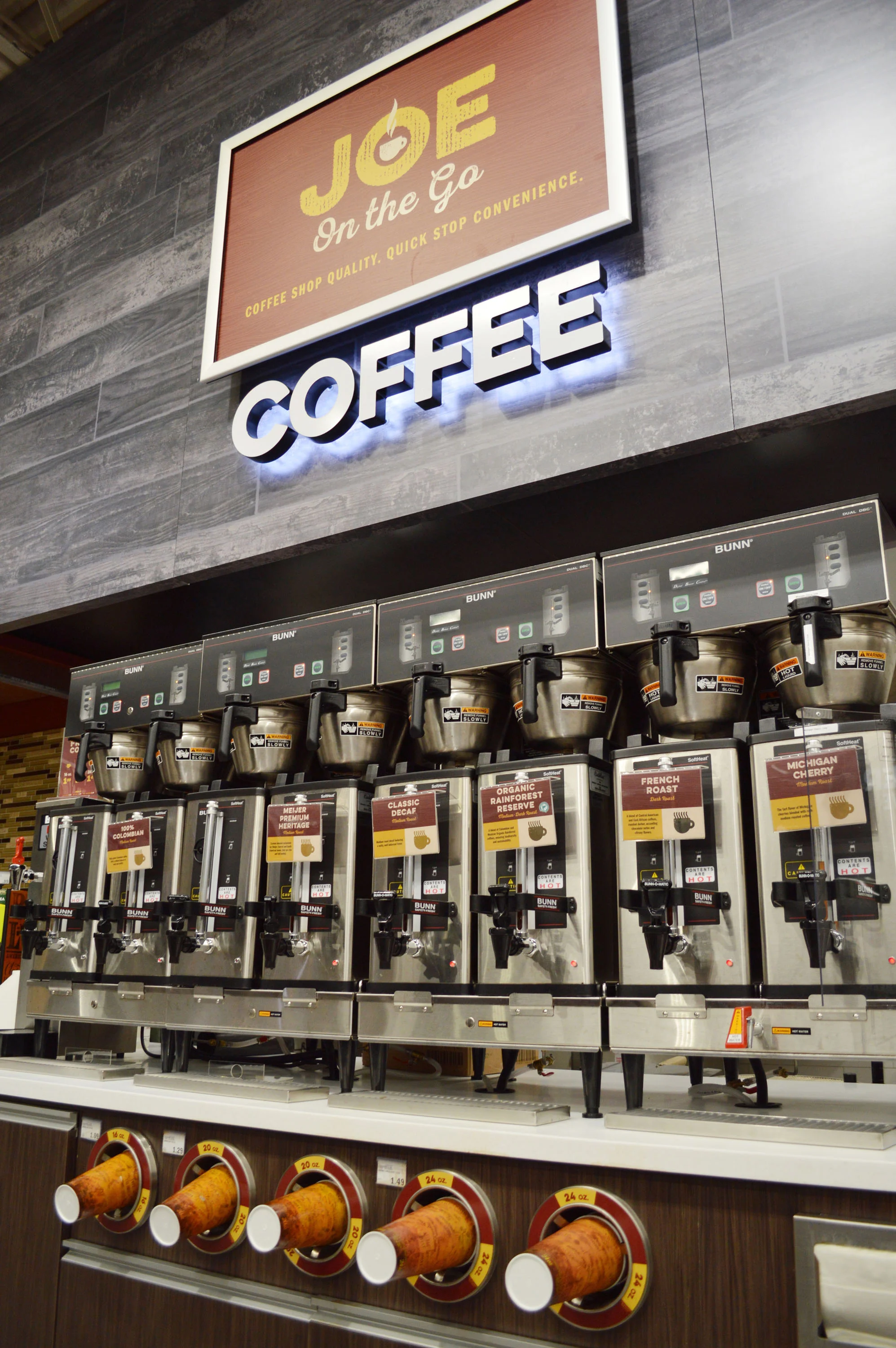
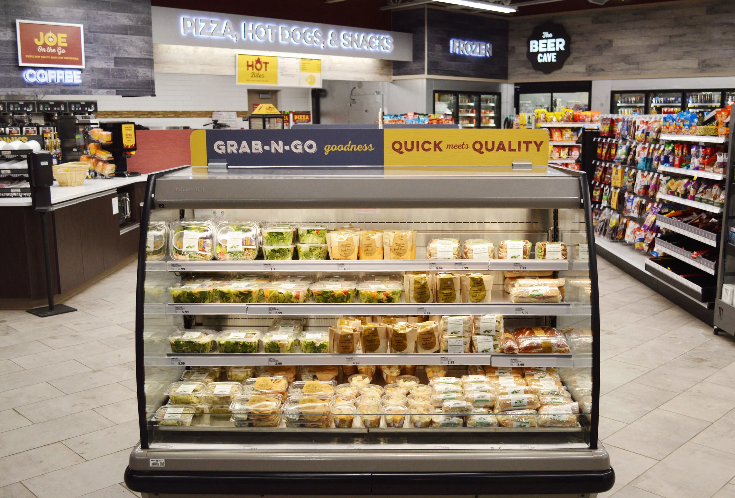
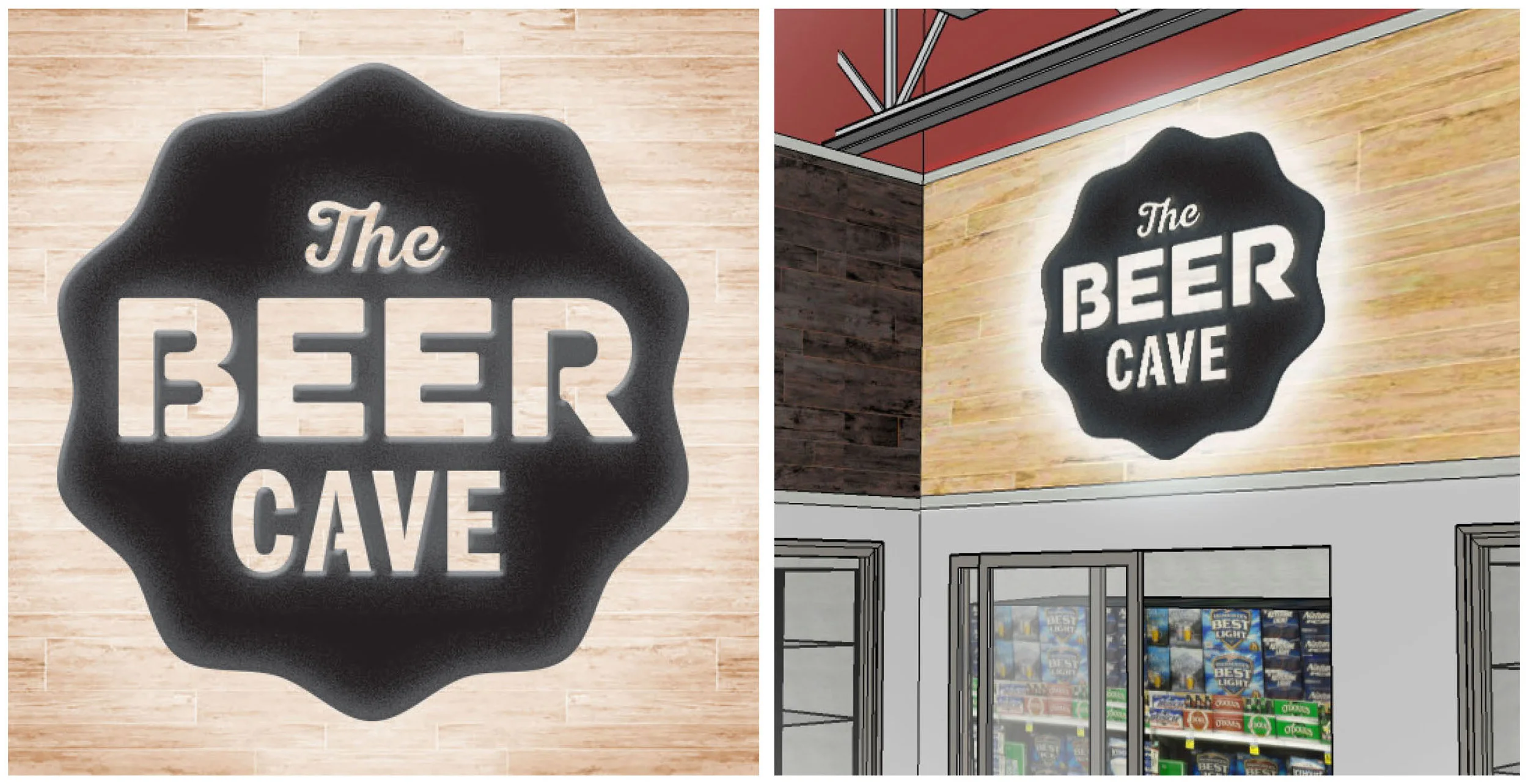
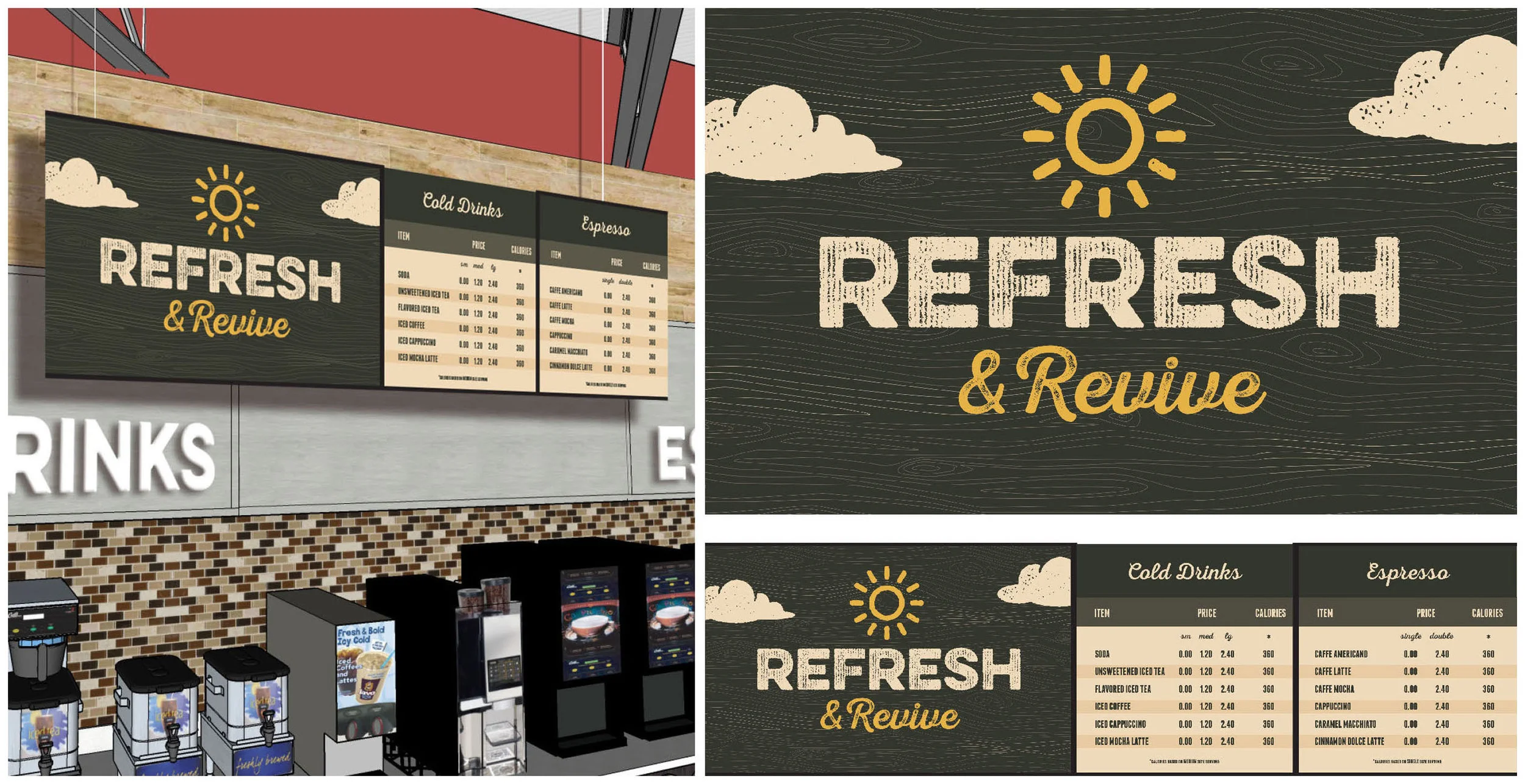
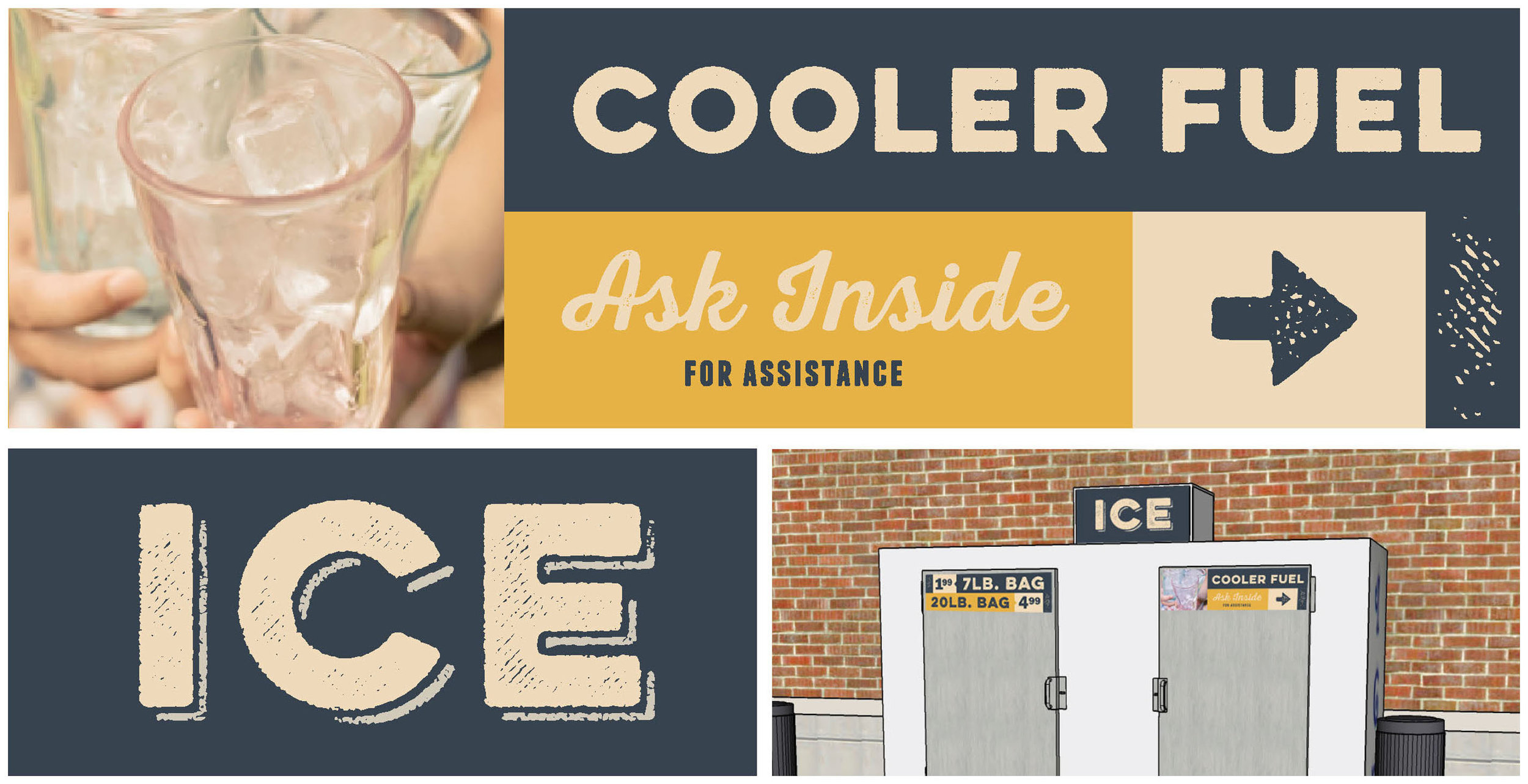
Meijer asked RedStitch to reinvent their c-stop sign package, with the goal of shifting the focus and shopper perception from "gas station" to fresh and friendly service-based convenience center.
Our solution was designed to maintain the tone of authenticity and warmth from the big box store, while introducing more playfulness and personality.

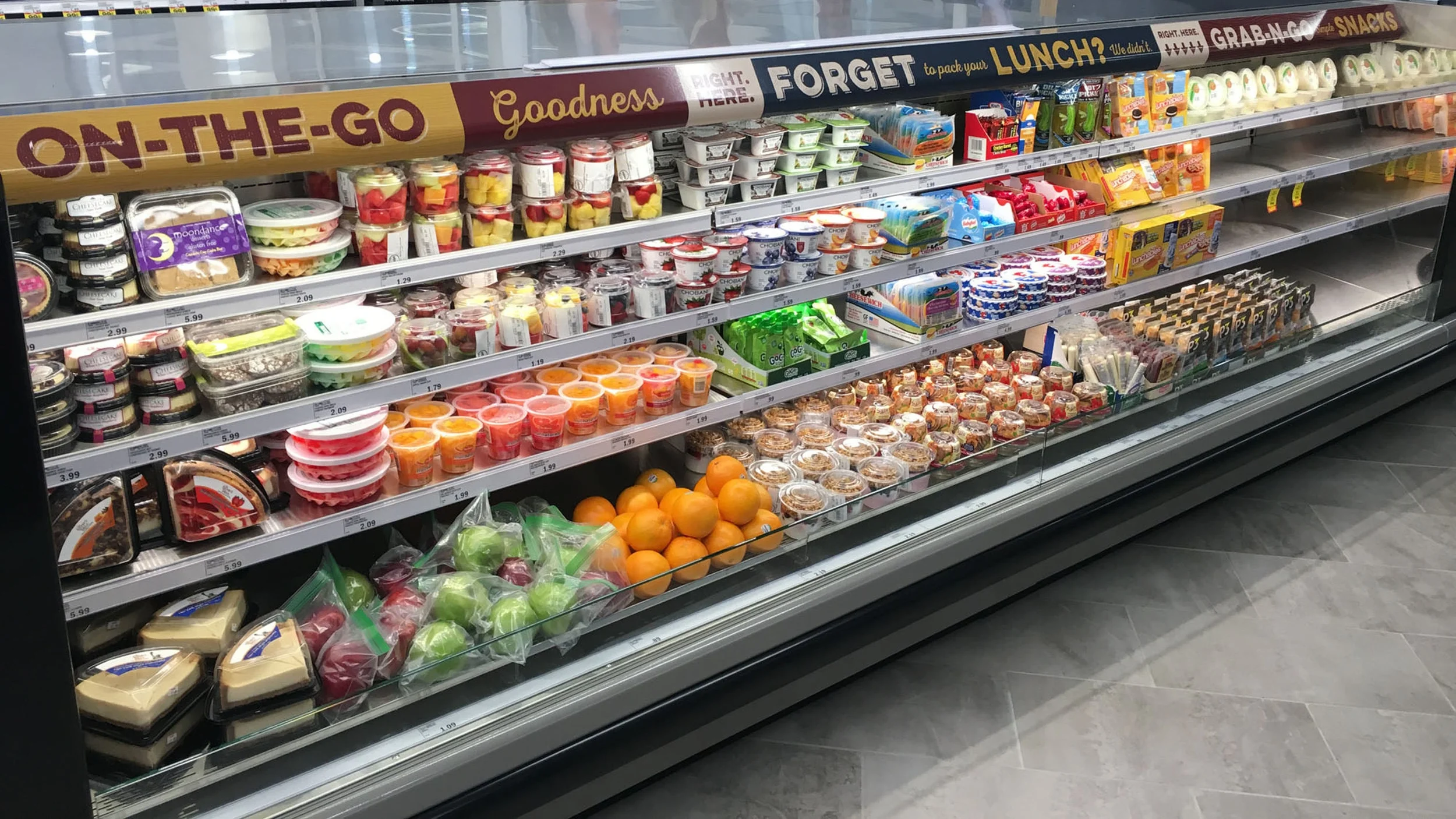
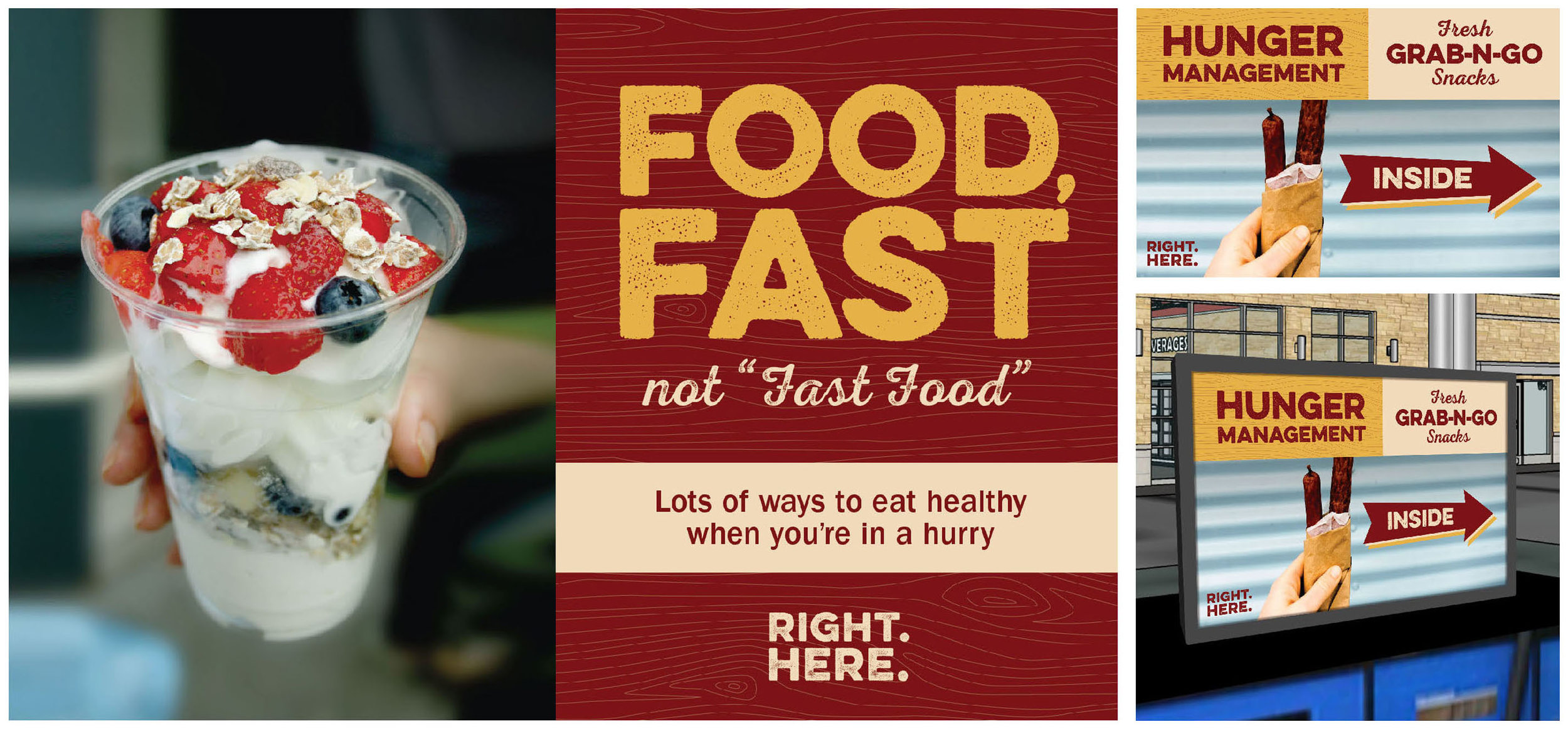
RIGHT.HERE.
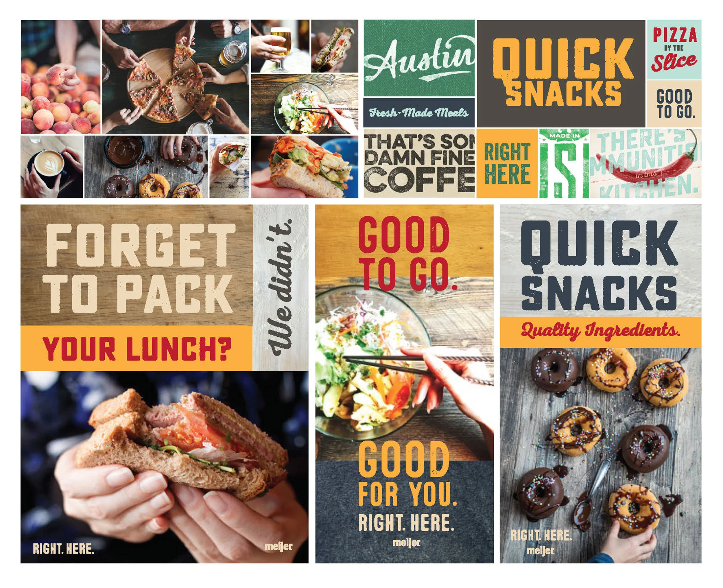
Early exploration featured crave-worthy photography of fresh food being eaten on the go, paired with modern fonts and color-blocked layouts.
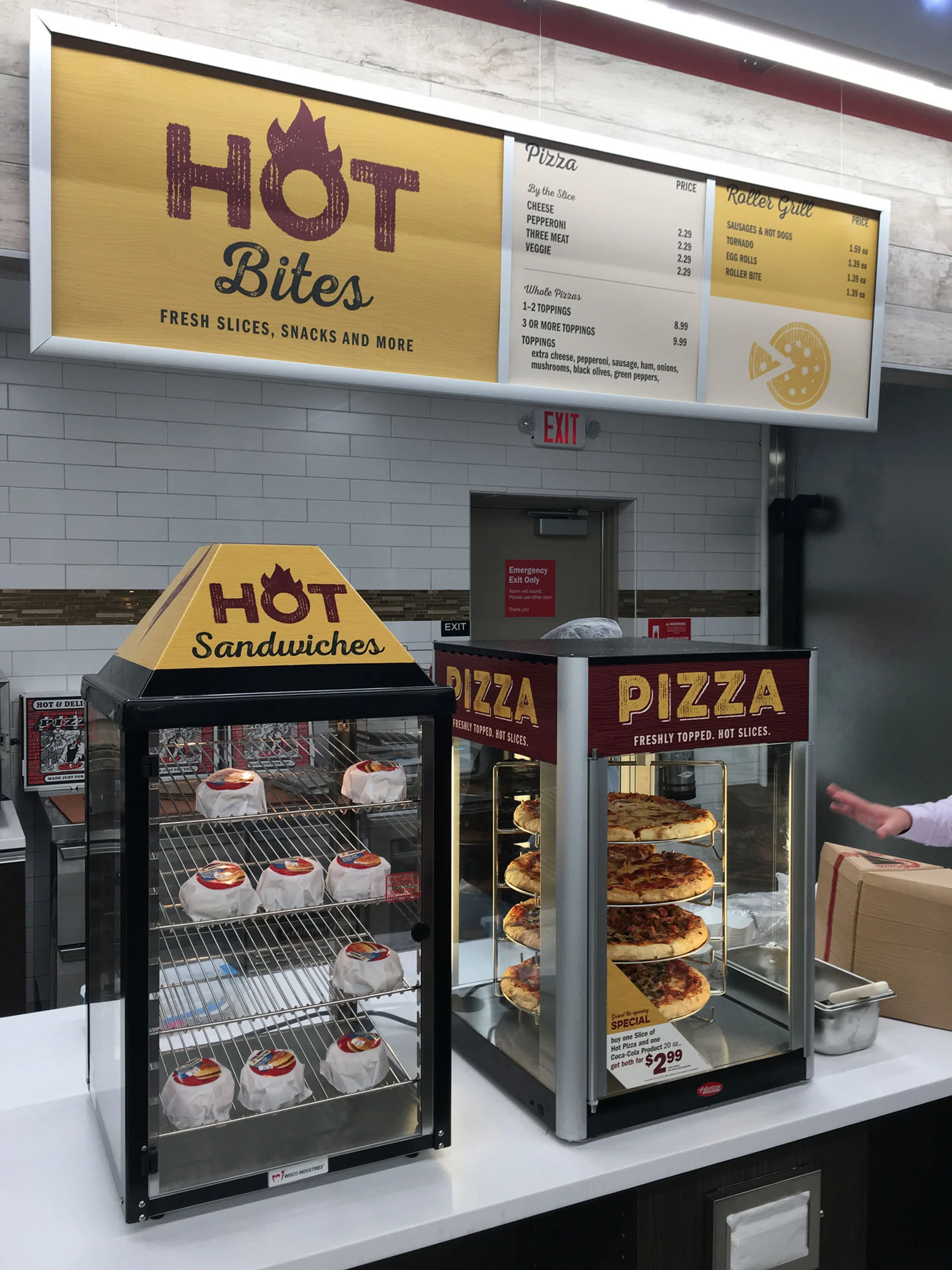
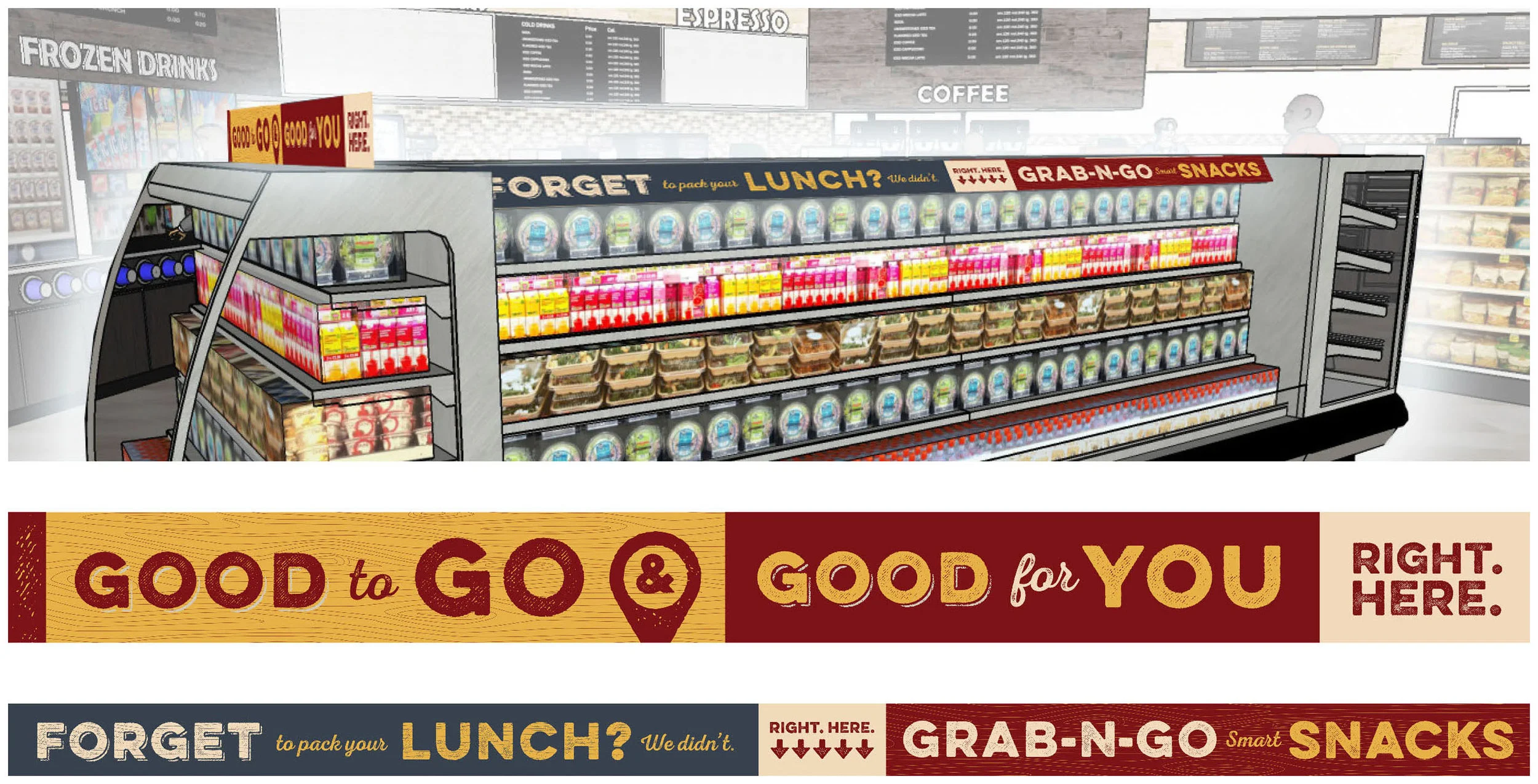
Distressed textures and font treatments lend a more casual feeling to the signage, while red and yellow are used to draw the eye to copy for a quick read. Icons and illustrated textures add interest to graphics, minimizing the need for photography.
The "Right. Here." tagline references healthier choices (eating right) as well as grab-and-go convenience (get it here).
Graphic Systems
messaging
installation